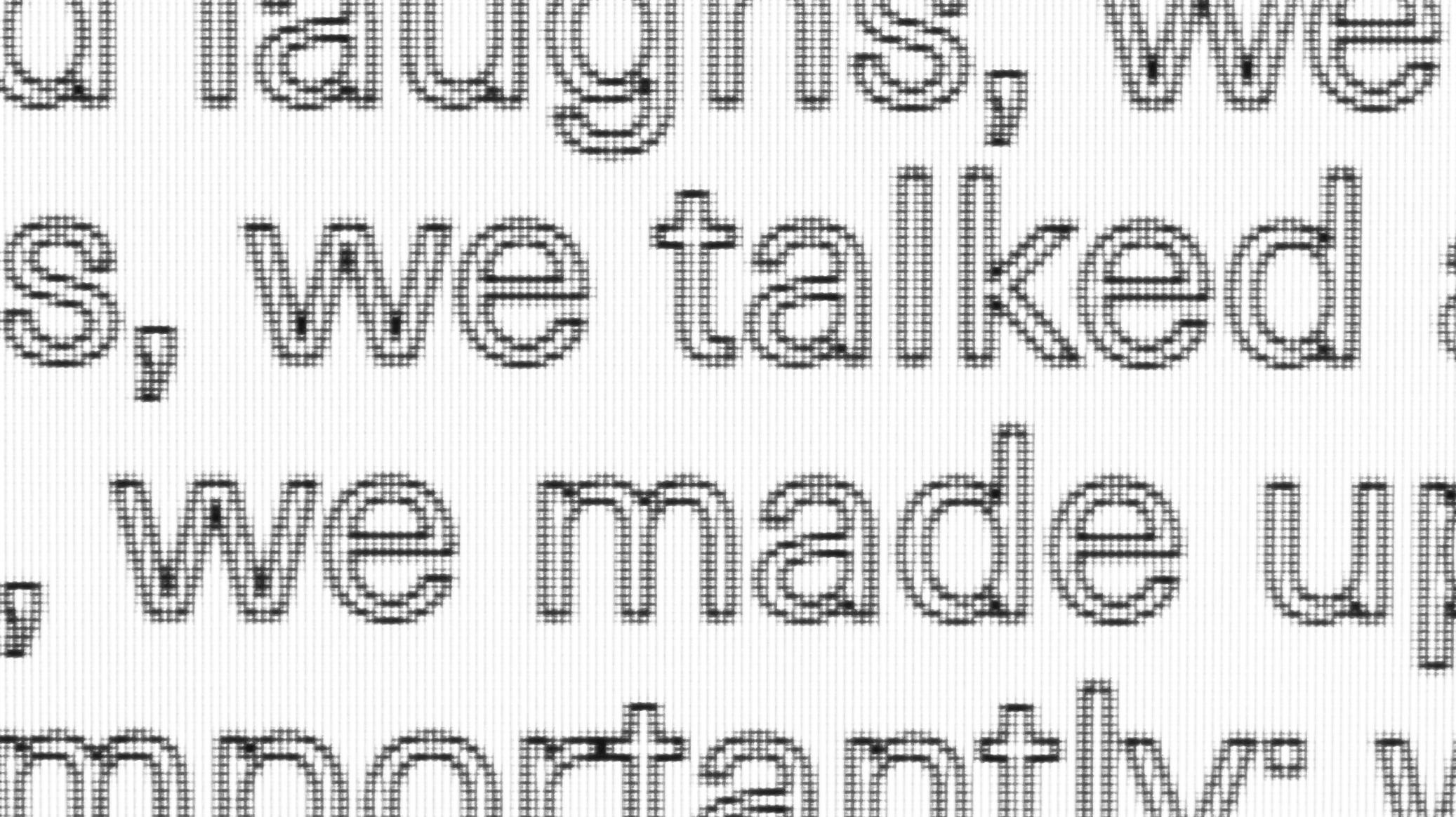
CSS Text Stroke

Challenge
The difficulties of stroked text in web browsers revealed themselves to me when working for this clients personal portfolio website. One great resource I want to mention was Chris Coyer's article on CSS tricks, check out his article. After his brief intro on the topic, we started to experiment, and it actually kind of worked... well in some way, and on some browsers at least.
Since fonts in browsers get rendered as vector graphics and look crisp at any size, one might be inclined to expect them to come with other affordances of vector graphics, like strokes and fill colors. Actually, they do, at least in a non-cross-browser experimental property called ‑webkit‑text‑stroke which is shorthand for ‑webkit‑text‑stroke‑width and ‑webkit‑text‑stroke‑color. With these, we can get somewhat close to what is possible in Vector graphic applications like Illustrator. Consider following code snippet:
h1 {

   -webkit-text-stroke-width: 1px;

   -webkit-text-stroke-color: black;

}


/* or shorthand: */


h1 {

   -webkit-text-stroke: 1px black;

}
Quoting Chris Coyer, having control over stroke color as well as thickness is nice but you can imagine what happens if want black outlines and a white fill on your text and your site gets rendered in a browser not supporting these properties. You loose the outline and your white text vanishes into thin air.
But in the name of graceful degradation, webkit has your back, with another proprietary property: -webkit-text-fill-color. As its name states it lets you choose a fill color and thanks to the prefix it's only applied when your stroke is as well, kind of like putting both in a @supports statement.
h1 {

  color: black;

  -webkit-text-fill-color: white; /* Will override color (regardless of order) */

  -webkit-text-stroke-width: 1px;

  -webkit-text-stroke-color: black;

}
Result
This style was one of the key elements of the design, we used it for navigational active states and hover effects. So by supplying fallbacks for older browsers we were not just making our designer happy but also ensuring a similar experience for a wide group of users. Almost 80% of browsers already have -webkit-text-stroke available so all we need to do is supply a fallback for the rest. But we didn't even have to go looking very far as a reasonable solution is found in the original article as well, via a good old omnidirectional text shadow.
@mixin stroked-text($width: 2px) {

  text-shadow:

          -$width -$width 0 #000,

          $width -$width 0 #000,

          $width $width 0 #000,

          -$width $width 0 #000;

  color: #fff;


  @supports (-webkit-text-stroke: $width black) {

    -webkit-text-stroke: $width black;

    -webkit-text-fill-color: white;

    text-shadow: none;

  }

}
Consolidating these different techniques in a mixin, ready to be used, was quite a lot of fun. Going from "high brow in the design review meeting because your really not sure how support is for this one certain feature" to "yeah sure, i got this" is to me one of rewarding parts of the job.
Caveats
As always on the brink of wide browser support for features, there is not yet wide browser support. These two are the ones we encountered, in order of peculiarity:
- According to caniuse.com Firefox & Edge specifically, support the
-webkit-text-strokeproperty without having support with their own prefix. - Beware of browsers faux bolding your headings (this is not taken into account in stroke width calculation)
Be sure to check out Seth Jenks awesome examples of using background clip to make gradient strokes, and Henson & Chris Coyer's examples on CSS tricks
